The atmosphere of your day shapes your wedding colors. Colors either classic or strong define the atmosphere. This advice will enable you to select the ideal palette for your particular occasion.
Traditional Wedding Colour Schemes
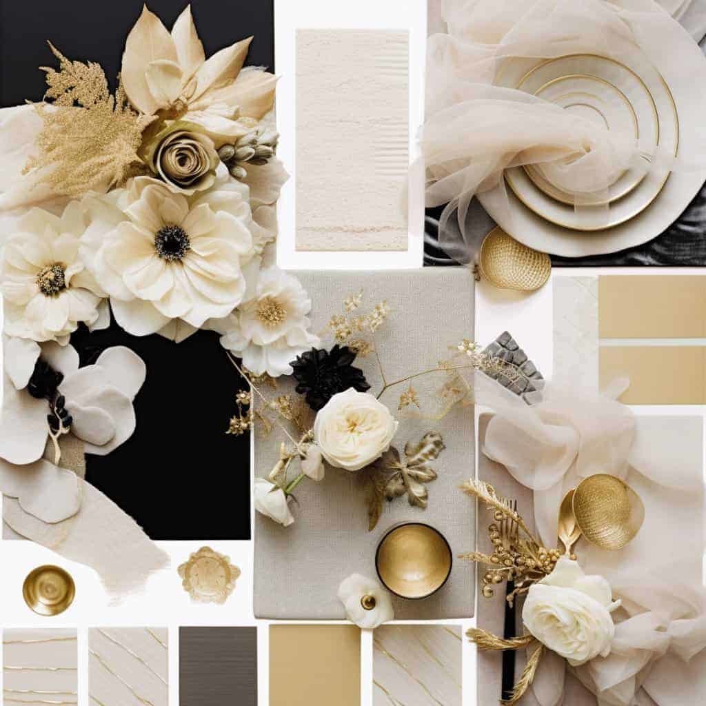
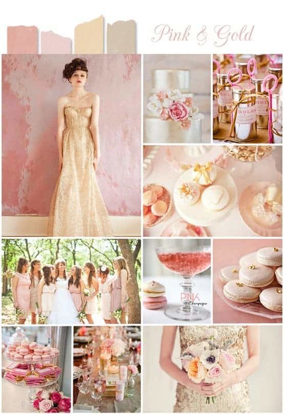
Classic colors never change with time. White with gold or pink combined with grey provides a sophisticated and elegant mood.
Illustrations:
White & Navy: Navy
Blish and Gold
Ivory & Burgundy:
Couples looking for a classic look will find these combos appropriate. Ideal for classic themes, they have an ageless look.
Strong, vivid colors
Strong colors energize your wedding. See brilliant pink, royal blue, or vibrant orange. These colors brighten any festivity.
Illustrations:
Coral and teal
Fuchsia & Navy; Orange & Emerald Green
Perfect for outdoor activities, these vivid colors accentuate the backdrop of the surroundings.
Gentle and Romantic Colors
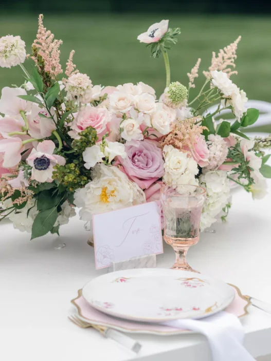
Choose soft pastels for a dreamlike vibe. Romance is set with light pinks, soft blues, and pale greens. These tones evoke a fairy-tale quality.
For instance:
Lavender and Grey; Peach and Mint
Rose, dusty and ivory
These tones look well in gardens since they mix with the environment to create a calm impression.
Trending Wedding Colors for 2024
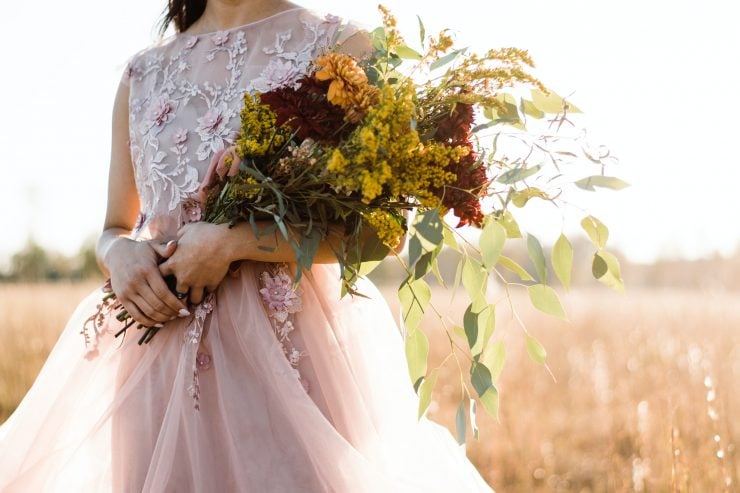
2024 will see mostly earth tones matched with metallic highlights. Count on colors like terracotta, sage, and mustard.
For instance:
Terracotta & Sage Mustard & Blush Olive Green & Gold
These hues create a warm but modern or rustic impression that fits current trends.
Match Your Colours to Your Location
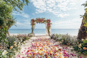
Think about your location before deciding on colors. Beach weddings go nicely with soft blues; ballrooms fit black or burgundy. Allow the natural components and lighting to direct your palette.
Seasonal Colour Scheme Palaces
Your decisions are influenced by seasons. Pastels sparkle for spring. Fall brings earthy colors; summer begs for vivid hues. Deep colors like blue or emerald are common highlights of winter weddings.
Seasonally, examples include:
Spring: lavender blushing
Summer: Coral; blue-turquoise
Fall: burgundy, mustard
Winter: Navy; silver
Neutrality with Accents
Trending is mixing neutrals with strong accents. While strong colors shine, neutrals give a quiet foundation. Contrast and depth are added by ivory with green or taupe with burgundy.
Adding Metallics
Gold or silver metallic elements accentuate your wedding colors. They create a luxurious effect in décor and accessories by matching nicely with both strong and neutral tones.
Examples:
Gold with Navy Ivory Silver with Navy
Rose Gold accompanied with blushing
The Part Flowers Play in Colour Selection
Flowers anchor your color scheme. Choose blossoms either complementary to or matching for your scheme. While gentle tones call for subdued blooms, bold colors pair opposing flowers.
Among other things:
Red roses for conventional designs
Sunflowers for vivid pallet designs
White peonies in romantic hues
Colours Blocking vs. Gradients
Pairing opposing colors in color blocking produces a strong impression. For a softer, creative appearance, gradients combine several tones of a single color.
Illustrations:
Colour Block: Navy and Hot Pink
Grade: Navy from Sky Blue
Select the look best for your wedding day vision. While gradients provide a graceful change between colors, colour blocking is strong and arresting.
Choosing your wedding colors is a fascinating action. These ideas will enable you to choose the ideal palette whether your taste is for bold modernism or classic elegance. Let your colors chronicle your life.


